A festival of intimate stories spun at the stage, where shadows intertwine with a dim, warm light. A feast of multi-threaded narratives which through their thoughtfulness, smile and ferocity, make the November in Upper Silesia unlike any other...
For over twenty years, the Ars Cameralis Festival has constituted a space of intermingling visual arts, music, theatre, film, and literature. Ars Cameralis events have dozens of faces and guises, but always rely on a unique atmosphere of intimate meetings of small audiences with music, language, or image.
The visual identity of the festival constructs a narrative about what is most characteristic of the Ars Cameralis events â their cosiness, intimacy and sincerity of artistic expression. To illustrate these features, a graphic theme inspired by the sculptures of Auguste Rodin was developed. The artist, living at the turn of the 20th century, who by combining elements typical of symbolism and impressionism, while continuing the romantic tradition, became a precursor of modern art. The sensuality of his sculptures, their vibrating structure in a unique way reflect the nature of the erotic sphere of human life.
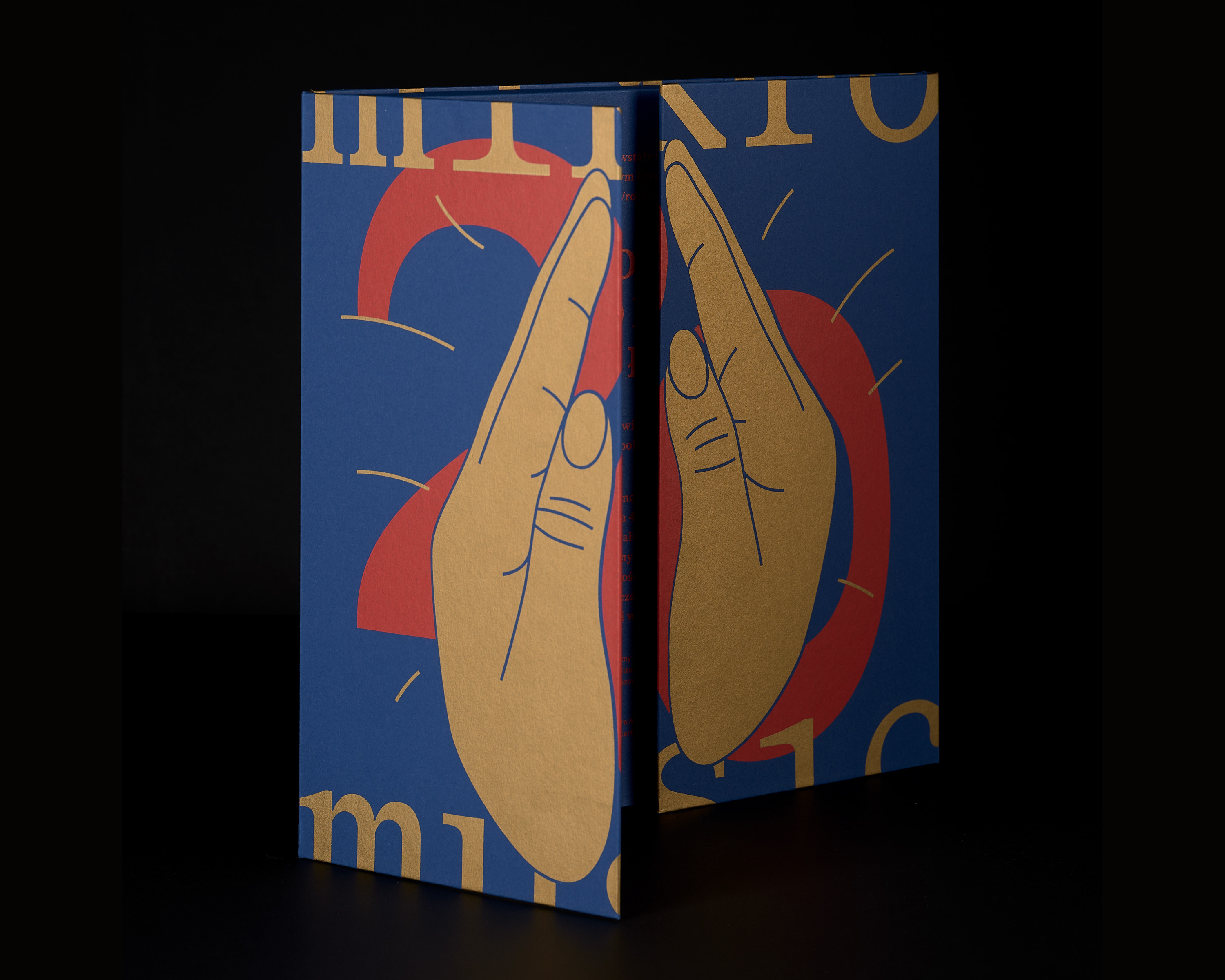
The main graphic theme, on which the whole festival identity is based, draws on representations taken from the iconic works of Rodin: Cupid and Psyche, Eternal Spring and The Kiss. Isolating female figures from the composition draws attention to their ecstatic experiences and their similarity to the experiences of the participant in artistic events during the festival. The outline of the sculptures was simplified, their fluid and gentle shape emphasized, and then overlaid onto each other to form an image in which intertwined womenâs bodies evoke a feeling of sensuality, uniqueness of the moment and deep emotion. Soft, organic, sometimes heavily cropped female silhouettes reflect the liveliness of the festival matter. The resulting image was not literal and clear at first glance, but its almost abstract form emanated a subtle eroticism and suggested sentimental connotations. The muted, warm range of colours: a mixture of orange, yellow and pink, placed on a background of deep navy blue emphasized sensuality, a dreamy mood and magical suspension in time. Gold lettering, elegant, adorning the image like jewellery, gave the whole an even more dreamlike, unusual character.
The primary element of the identity, connecting and explaining all the others, was the poster, which showed the whole graphic theme and featured text supplying the essence of the festival. Other promotional materials revealed only fragments of the bigger image, body outlines were also overlaid on all photographs. The result is a graphic language akin to the works of Hans Arp â ephemeral, intriguing, and indirect.
The 23rd edition of the festival was also promoted by a series of 16 postcard flyers corresponding to specific events, programme leaflet in the form of a map, leporello leaflet presenting the part of the festival dedicated to film, and exhibition flyer. Every festival participant received a 60-page catalogue, there were invitations, access passes, billboards, bus shelter ads, dedicated posters, newspaper ads, internet campaign, and the website was updated with the current graphic theme.
photos — Barbara Kubska
