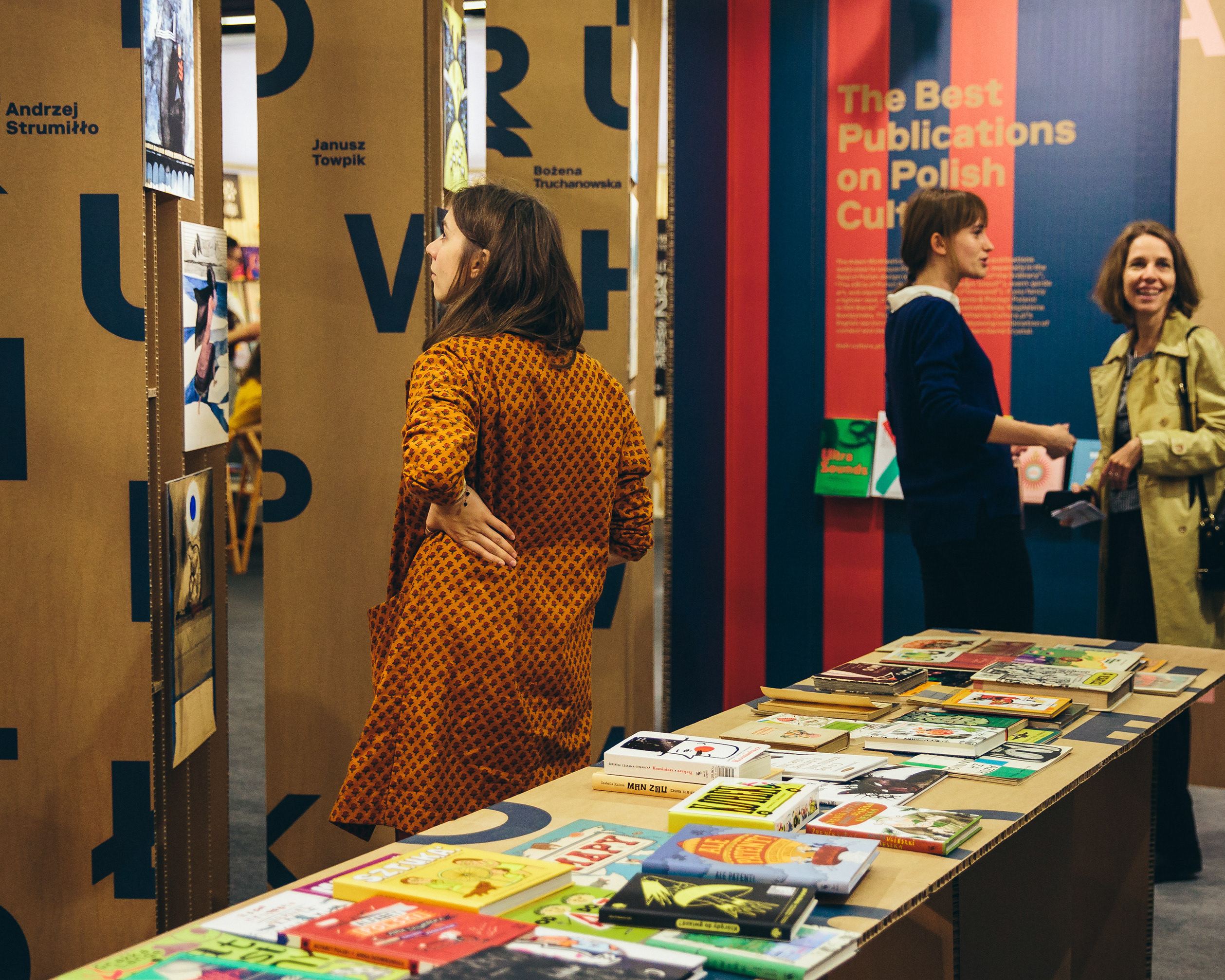
For 21 years Ars Cameralis Festival has brought music, artistic, theatrical and literary events to Upper Silesia. The goal of the Festival’s visual identity in 2012 was to emphasize the diversity of the programme by delivering a clear and bold statement. All the more so in November, when the weather is rather unfriendly, and the streets in the cities where the Festival is taking place are dirty, grey, featureless, gloomy and half asleep.
The main idea for the visual identity was to direct messages at various groups of recipients – fans of various arts. With this aim, colour-coding was used and a set of pictograms / symbols was designed to represent each of the arts:
1. Ars: music was marked with a heart and the colour red. The heart means rhythm, life, sincerity.
2. Ars: fine art is a peacock’s feather (symbolizing beauty, but also vanity) and the colour turquoise.
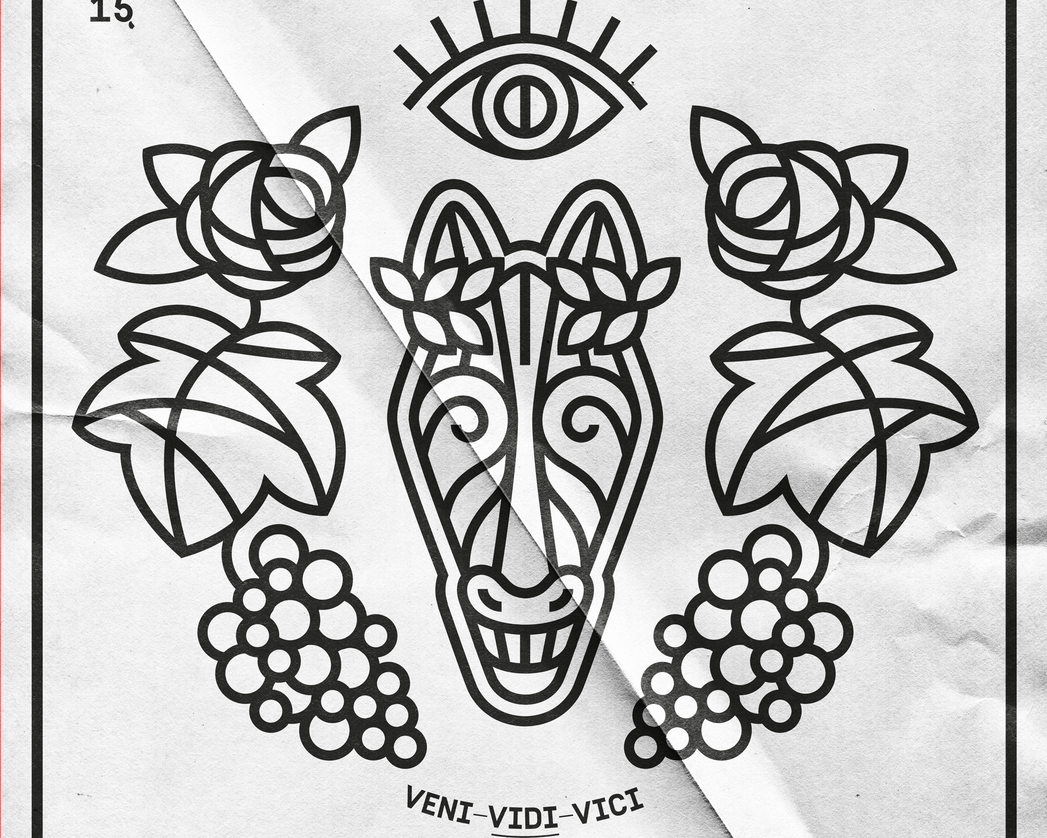
3. Ars: literature is represented by a bunch of grapes, evoking poetry, on a purple background.
4. Ars: theatre is denoted by fire (transgression, change, energy) and the colour orange.
The four main graphic motifs are depicted in a linear and synthetic way. The form of the signs was to relate to the language of visual information systems on one hand, and high art on the other. A tangle of thick lines creates an ornament, out of which each symbol emerges. The ornament was used as a whole or in parts (e.g. on catalogue covers). The symbols function independently as a series of posters or they are joint together to form a more complex illustration used in printed materials referring to the entire festival (in this case the colour black is used).
Visual identity of the Festival in the previous editions gave primacy to creative freedom of the author, which in some cases meant that the message was not clear to all the recipients. The identity of the 21st edition was first and foremost user-oriented, tailored to the needs and expectations of recipients.
The catalogue submitted to the competition is made up of five brochures connected by a rubber x-band in one of the selected colours. The four brochures are devoted to each of the arts; the fifth, black one, is an introduction to the festival. The catalogues were printed on uncoated paper in duotone: silver and corresponding Pantone and have between 16 and 48 pages. Additionally, a series of posters, billboards, bus shelter advertisements, flyers, video spot, banners, access passes and other elements were designed.
