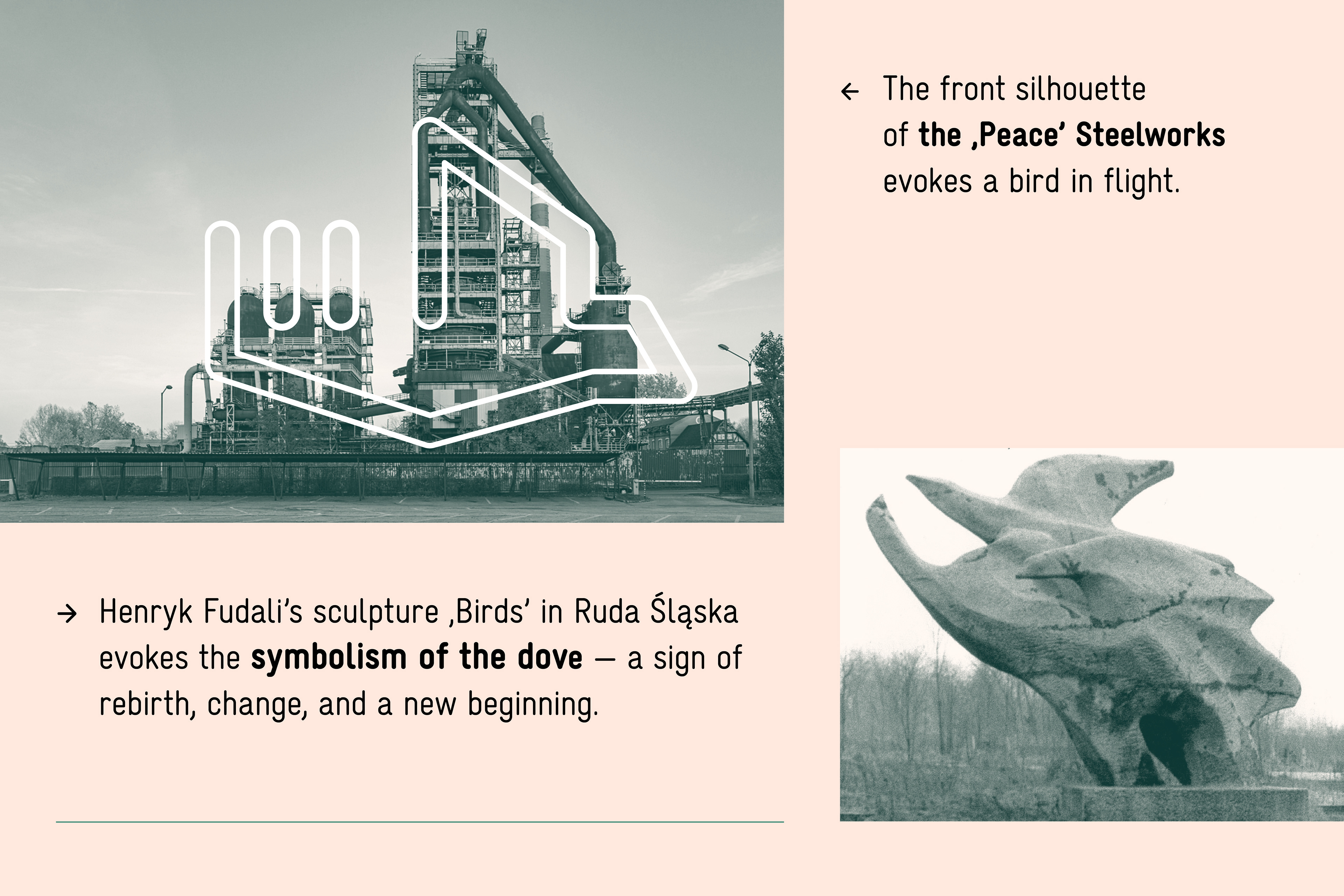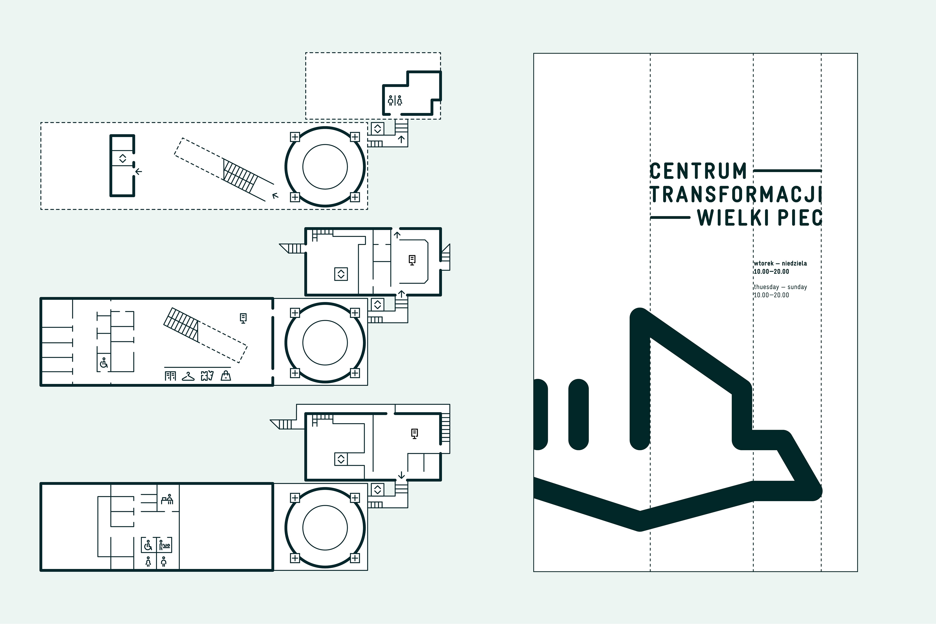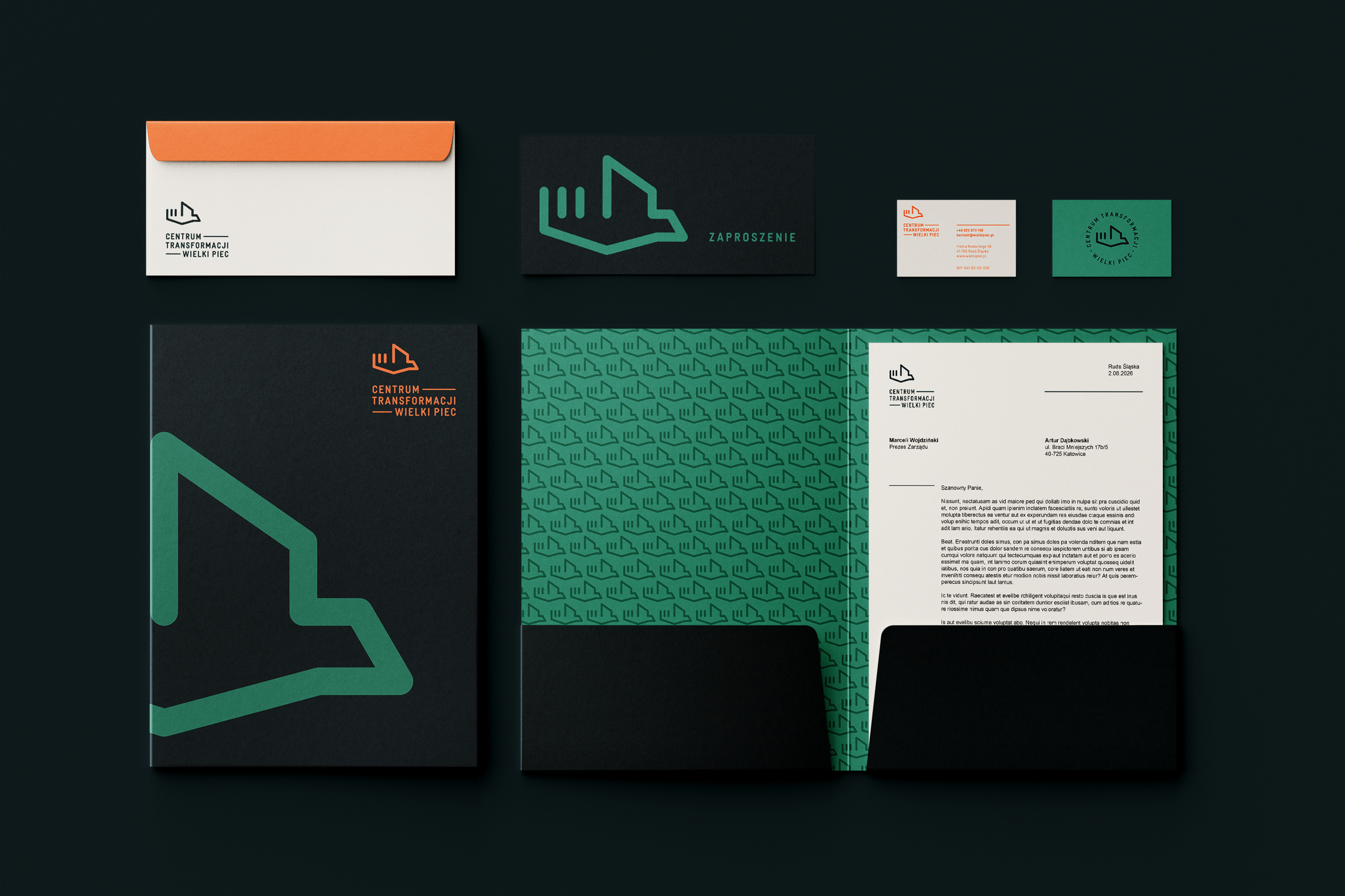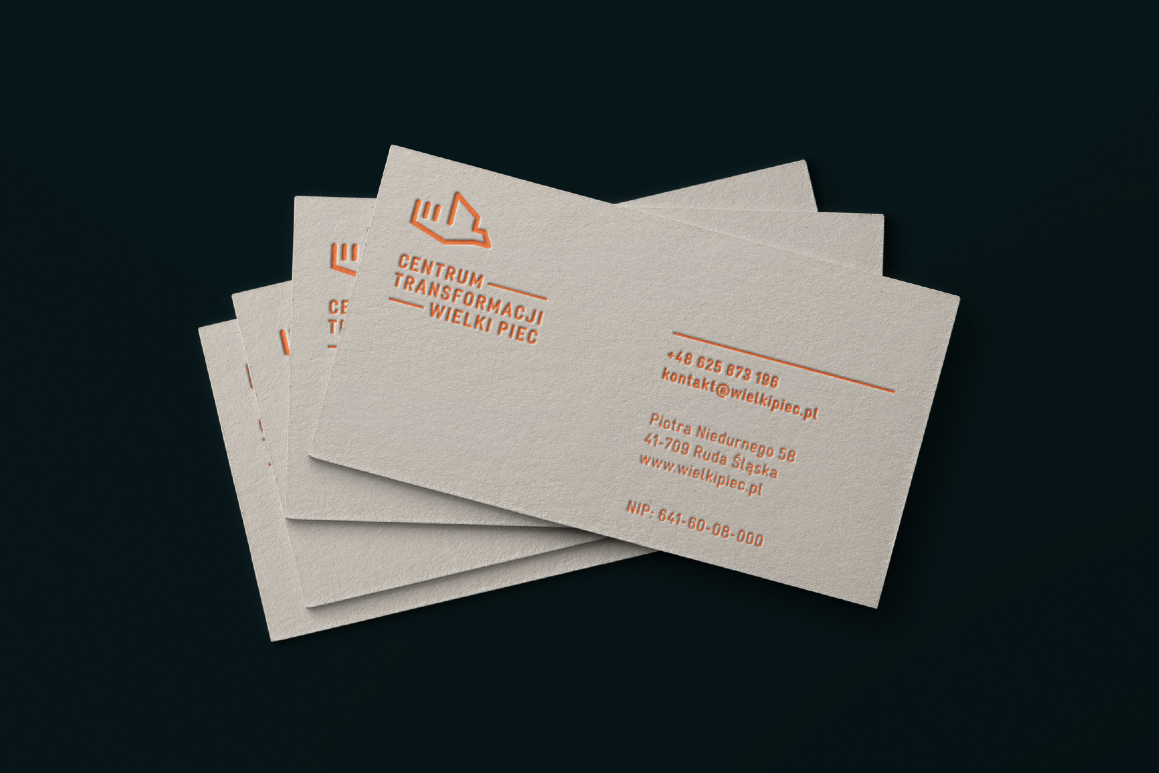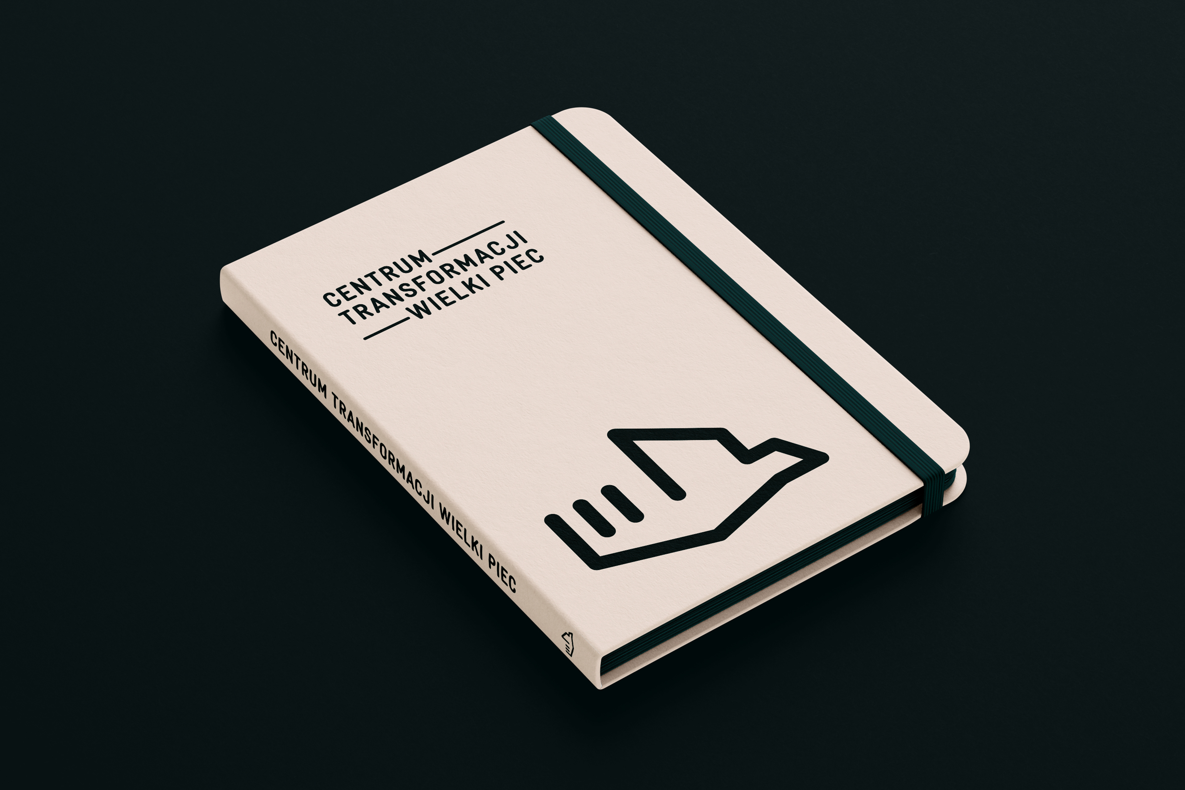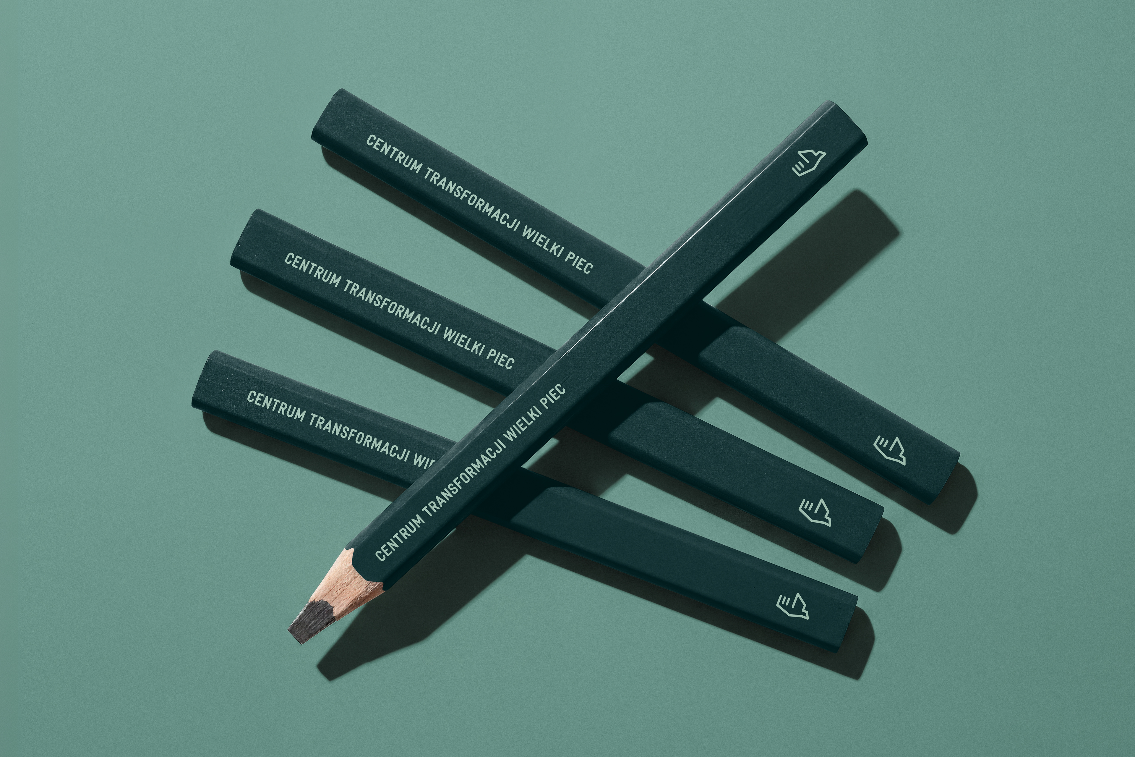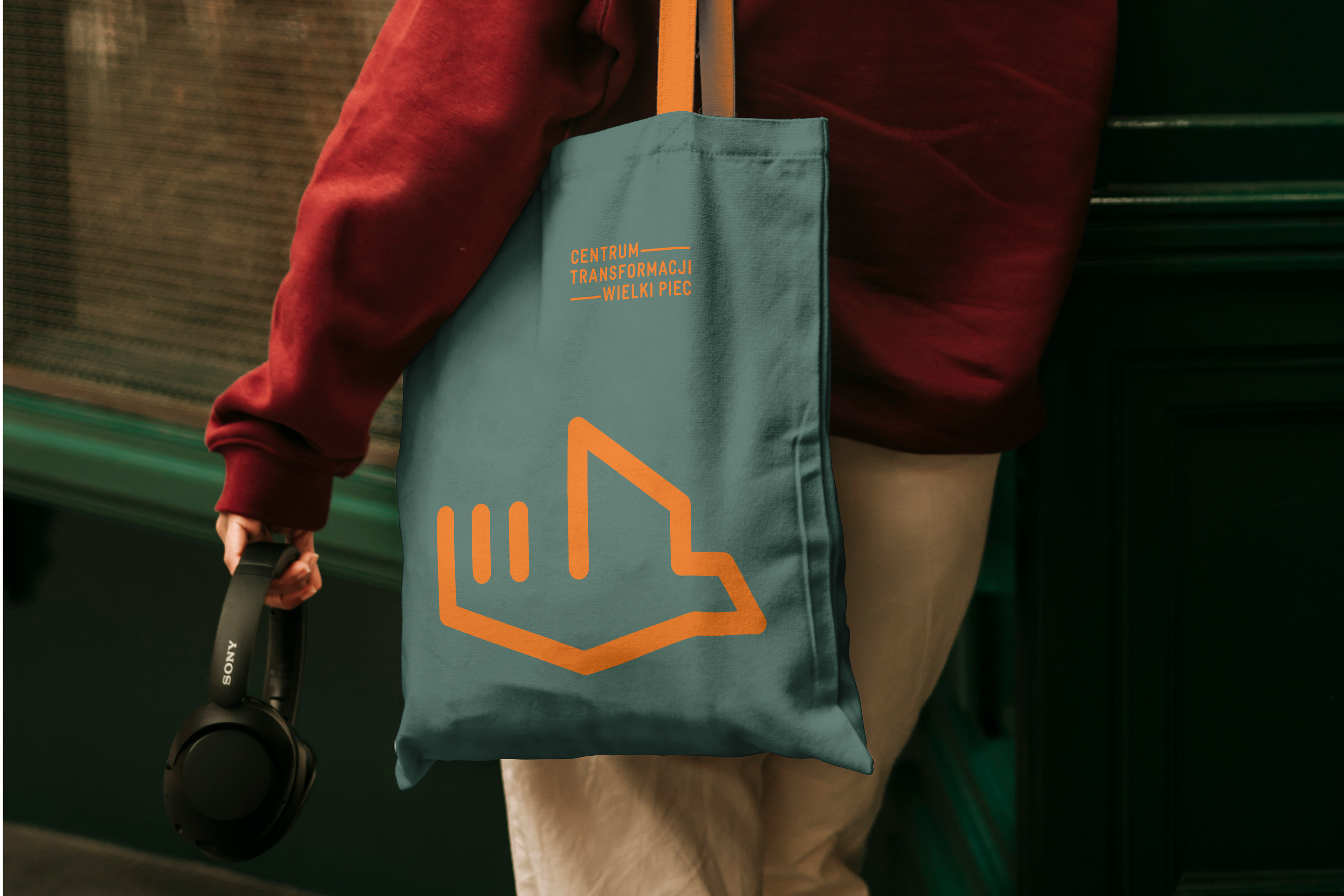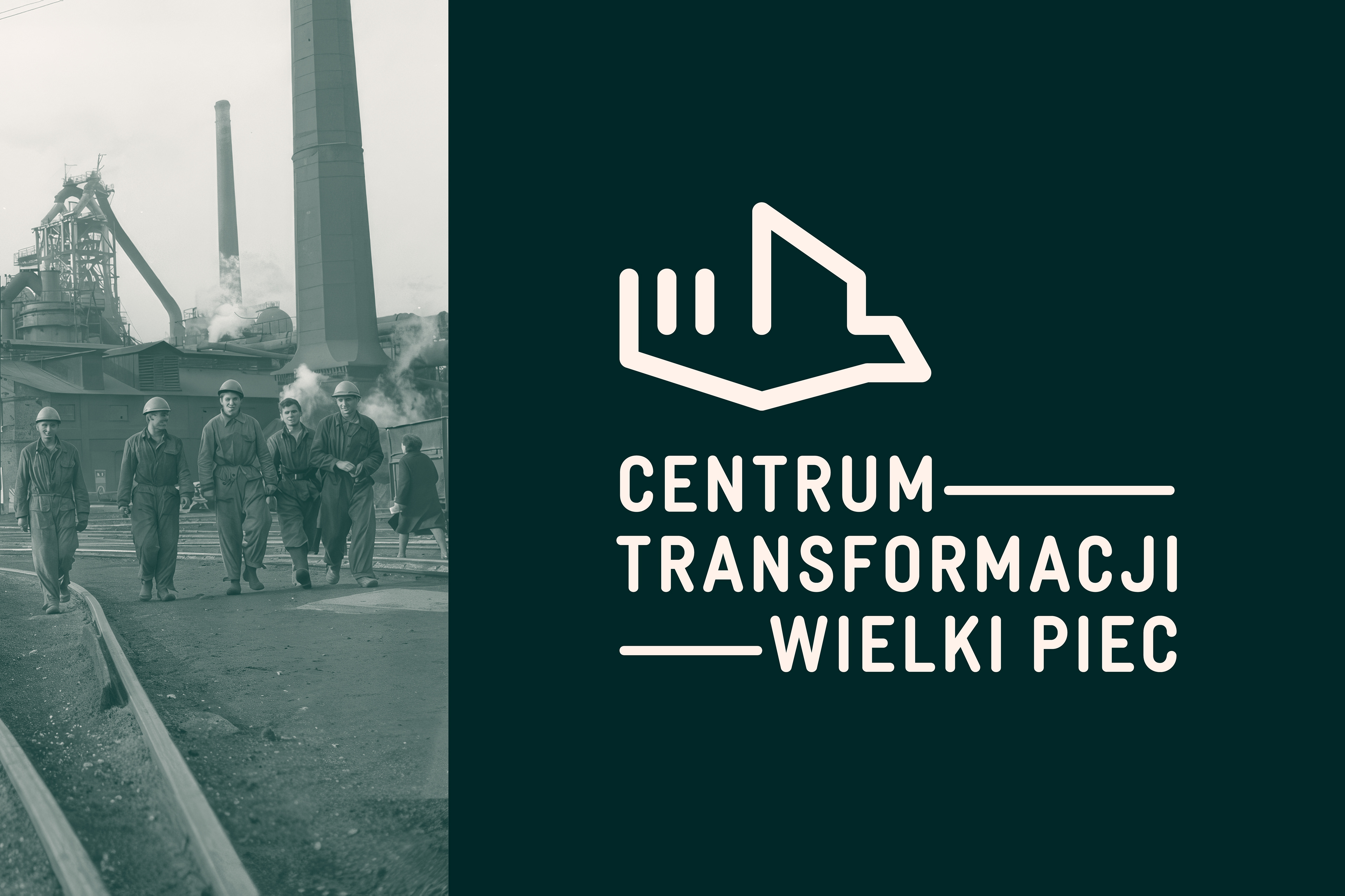
The visual identity is rooted in the idea of transformation. The logo reinterprets the silhouette of the Peace Steelworks, turning its industrial form into the shape of a pigeon in flight — a symbol of renewal and new beginnings. The concept is also inspired by Henryk Fudala’s Birds sculpture in Ruda Śląska and the idea of Fourth Nature, referring to the regeneration of post-industrial landscapes.
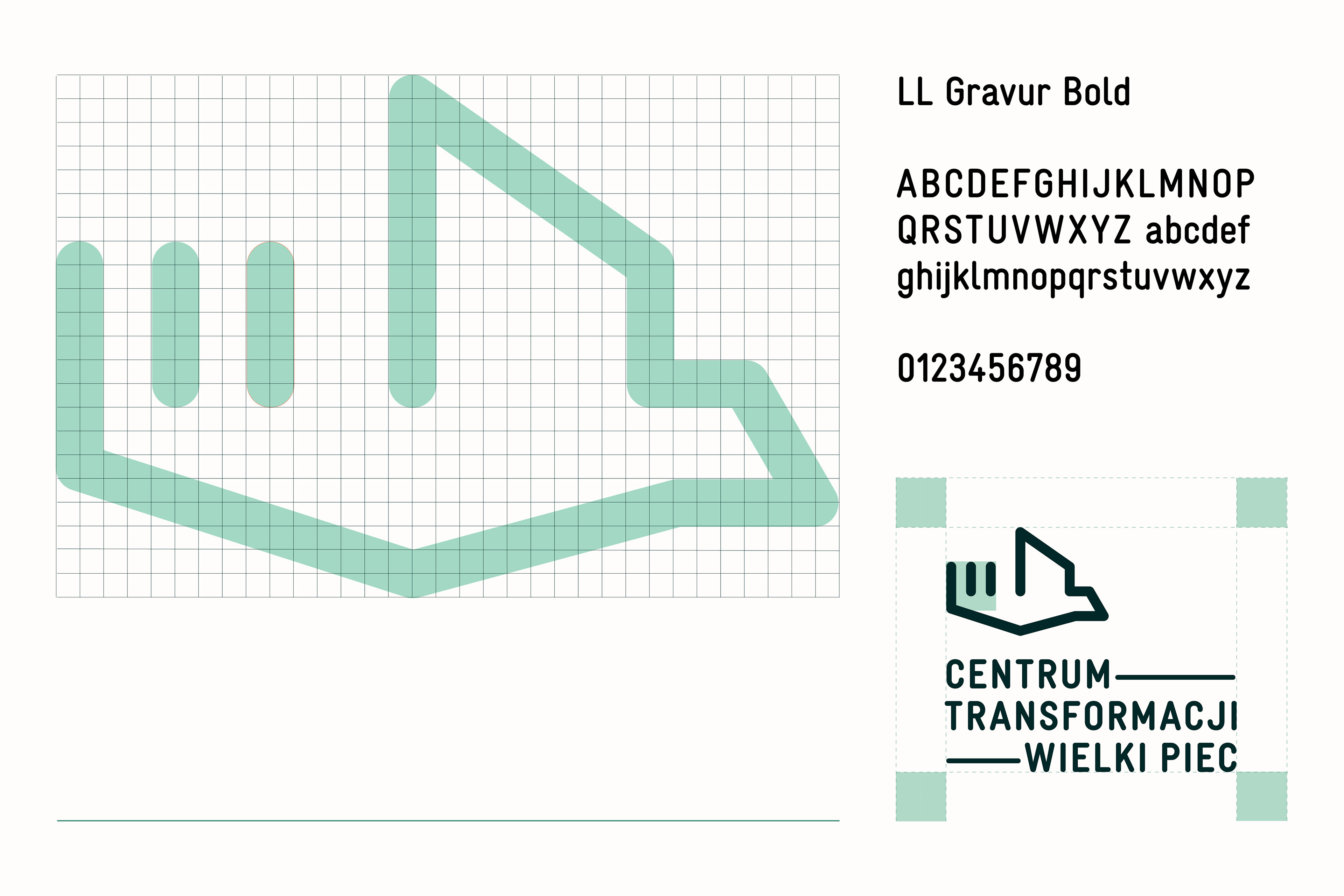
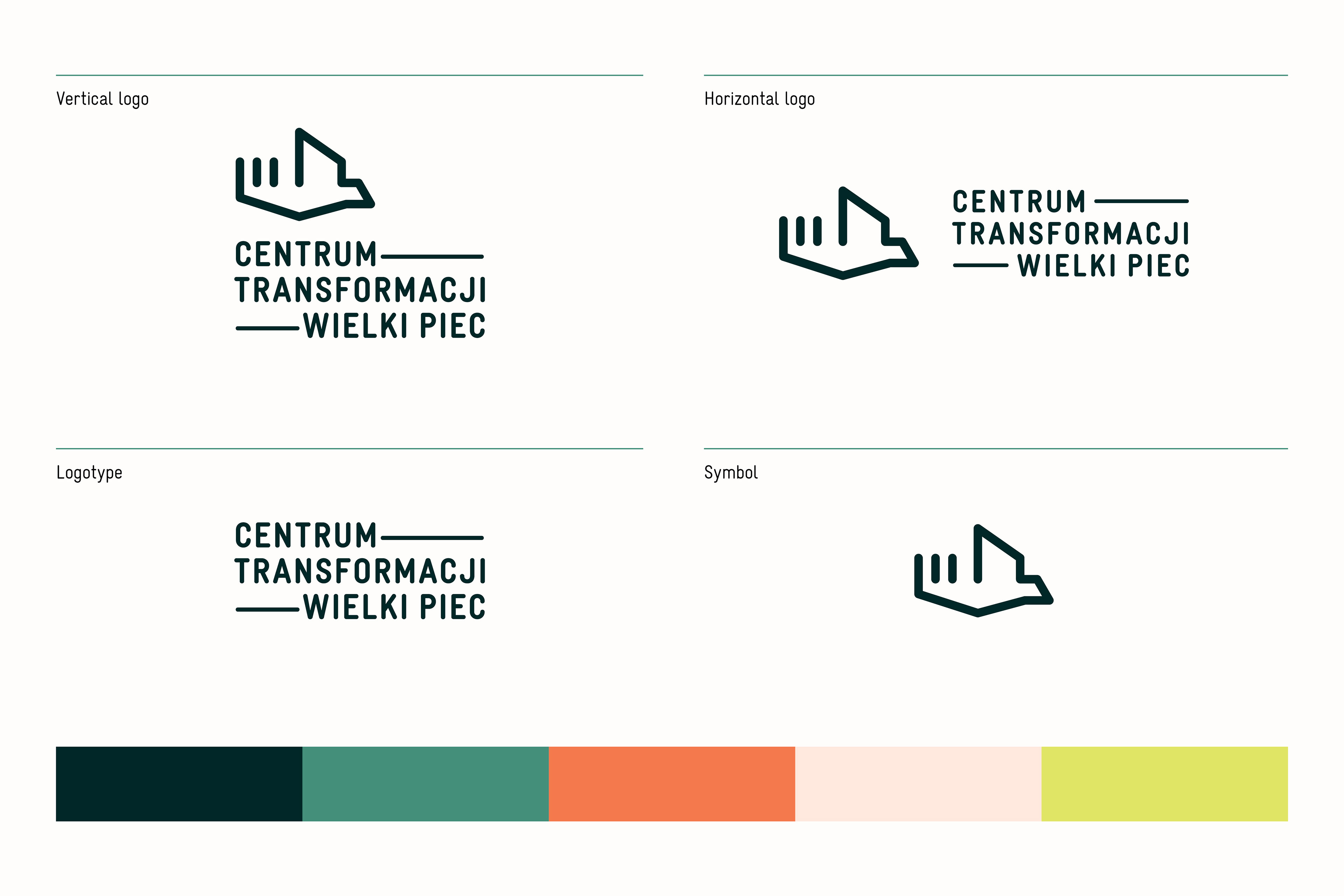
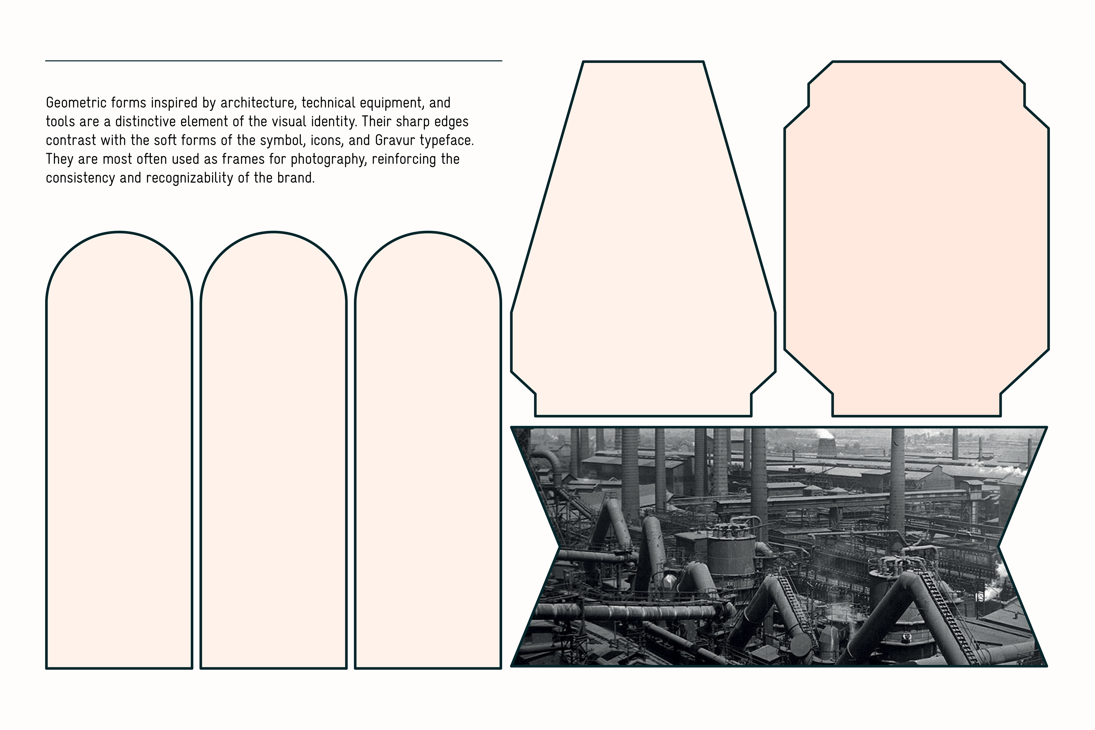
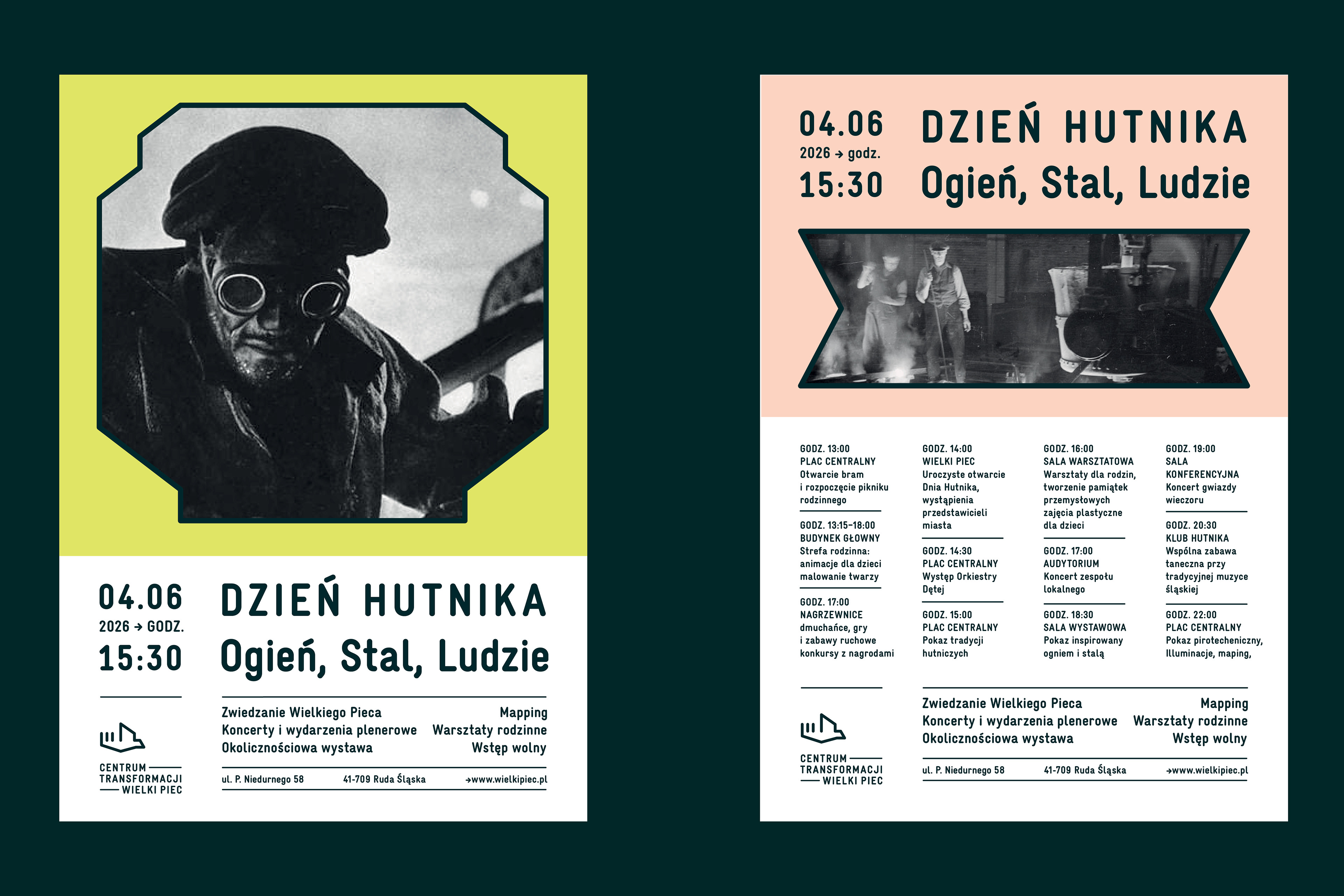
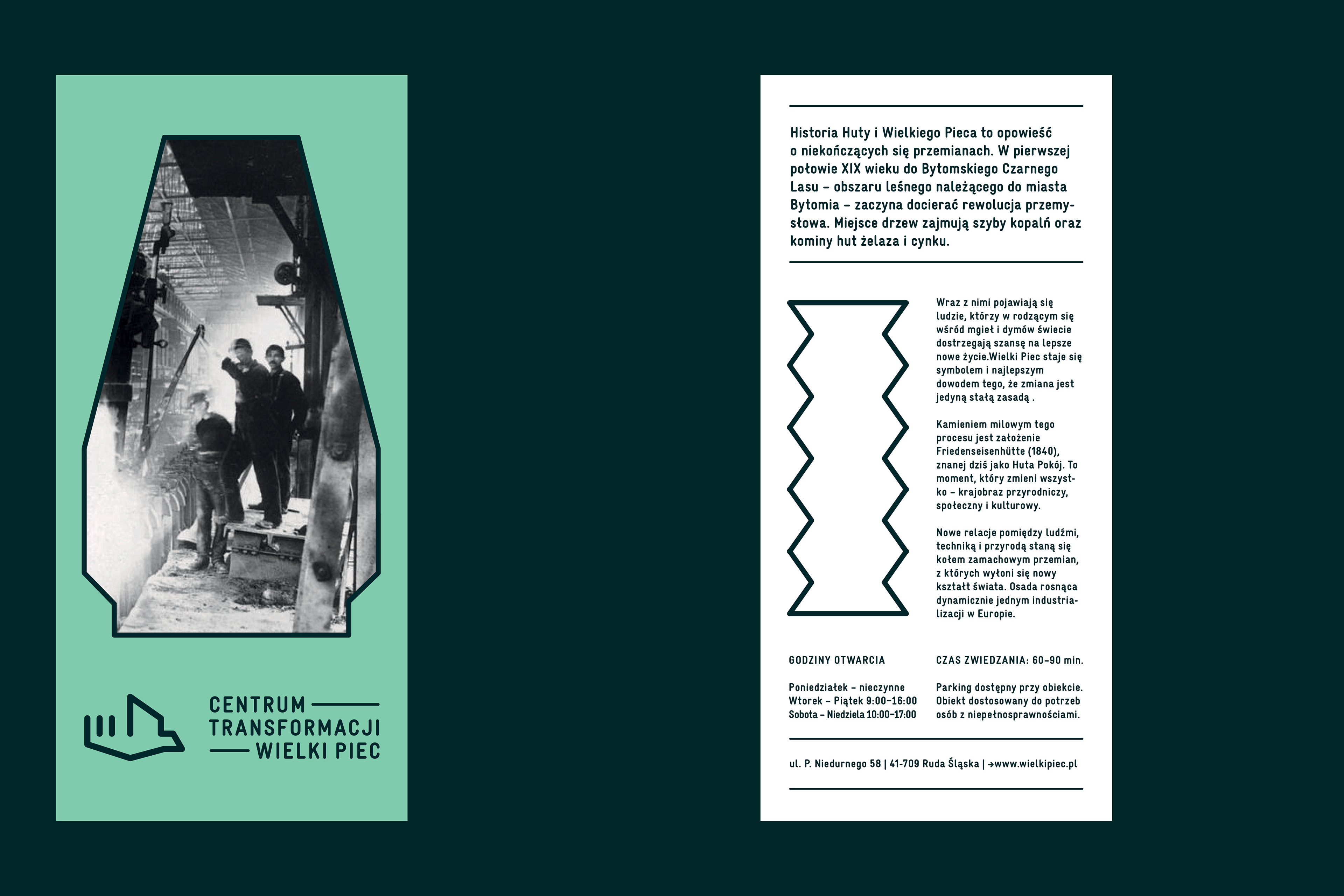
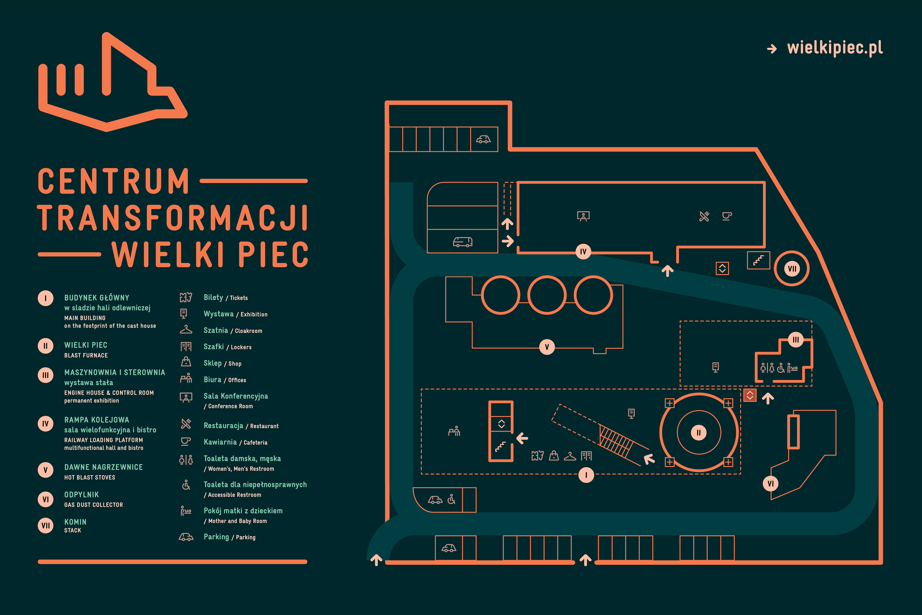
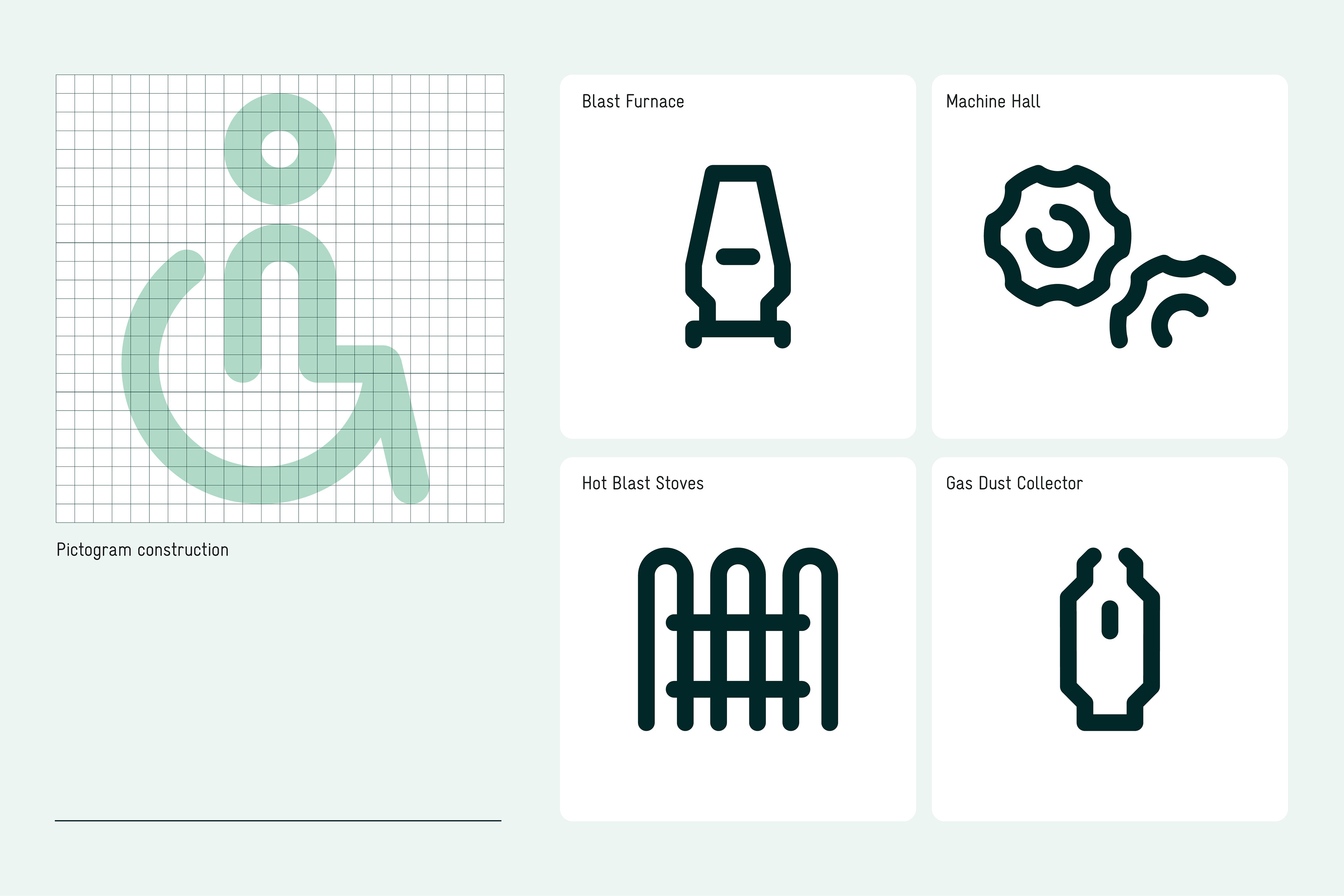
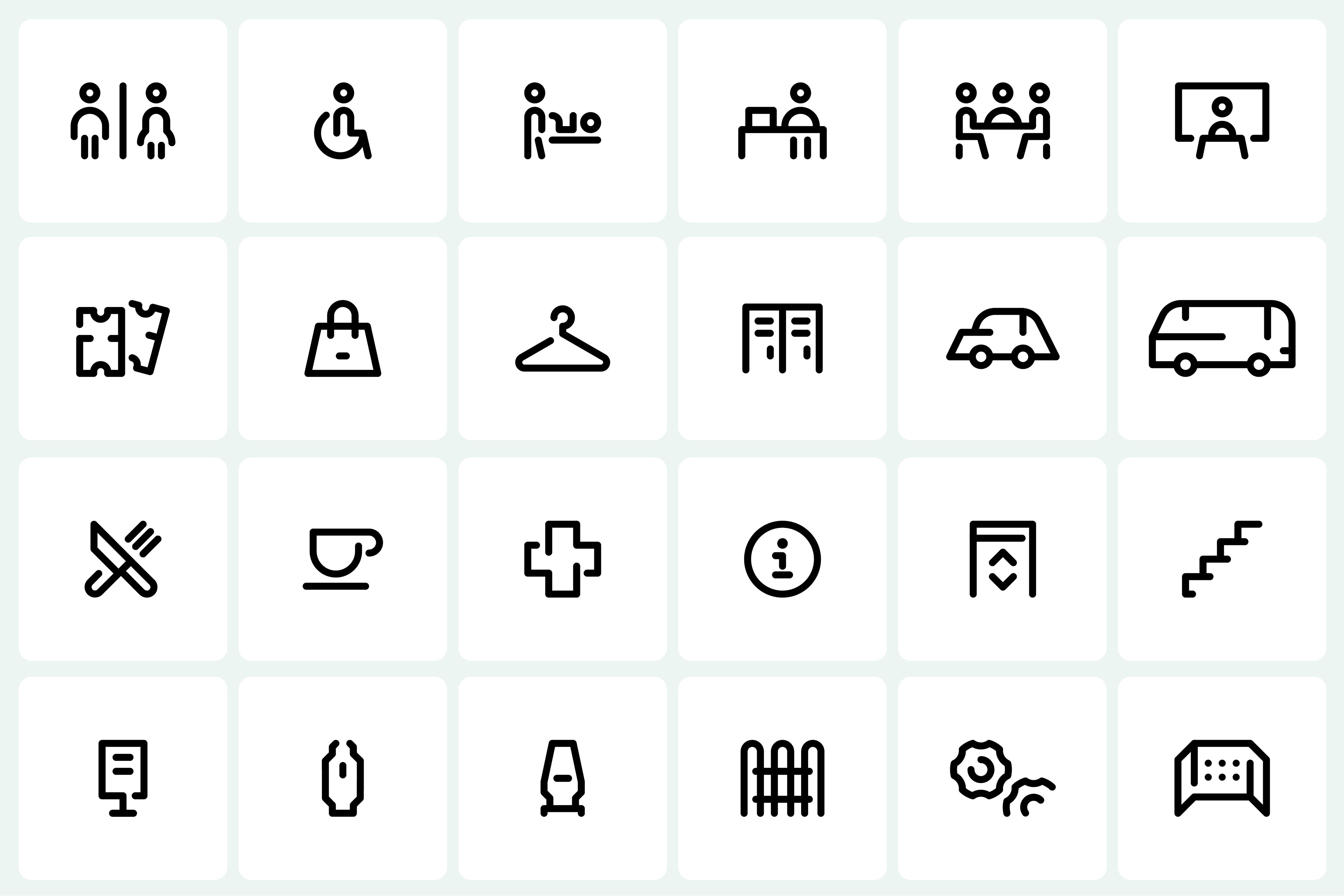
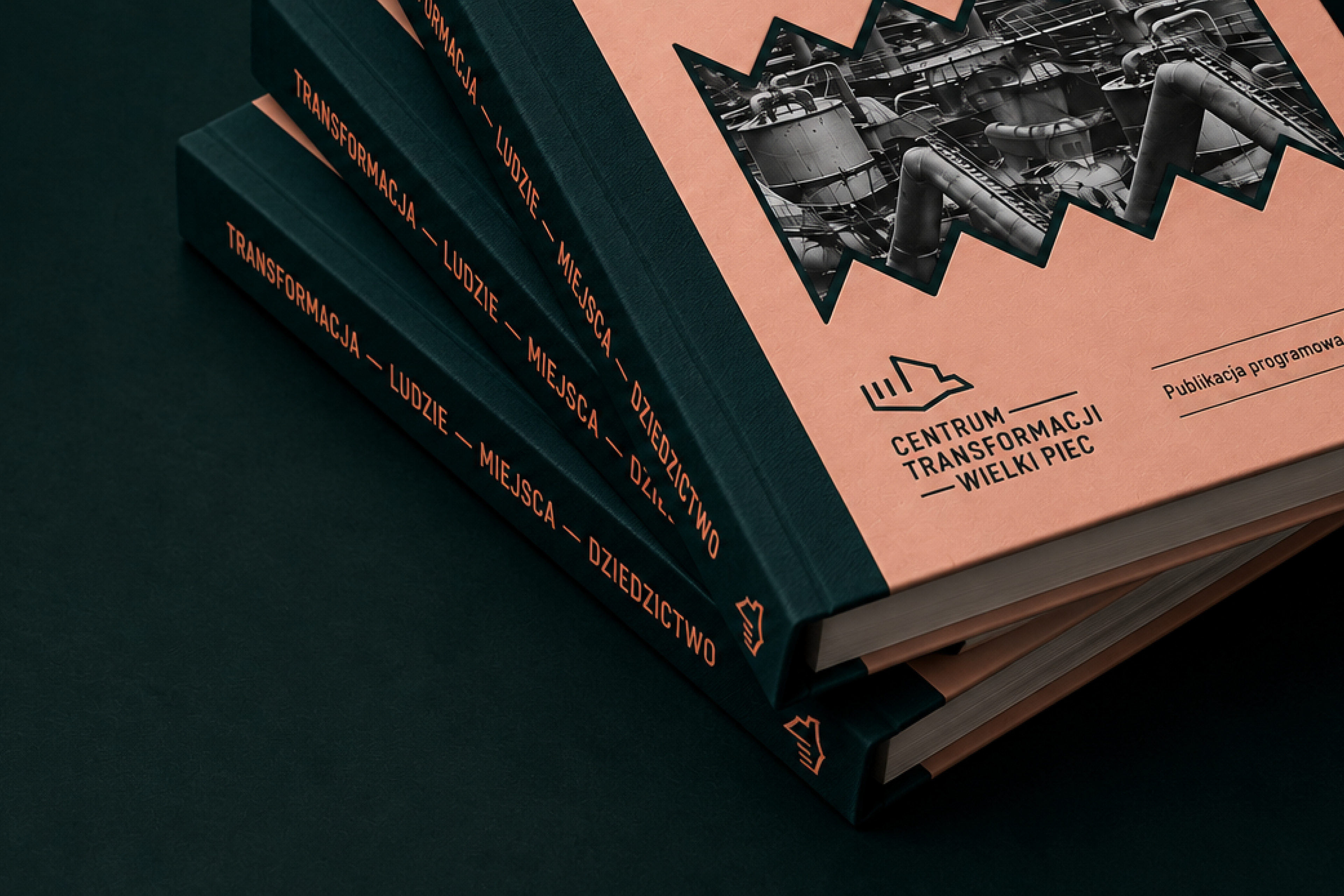
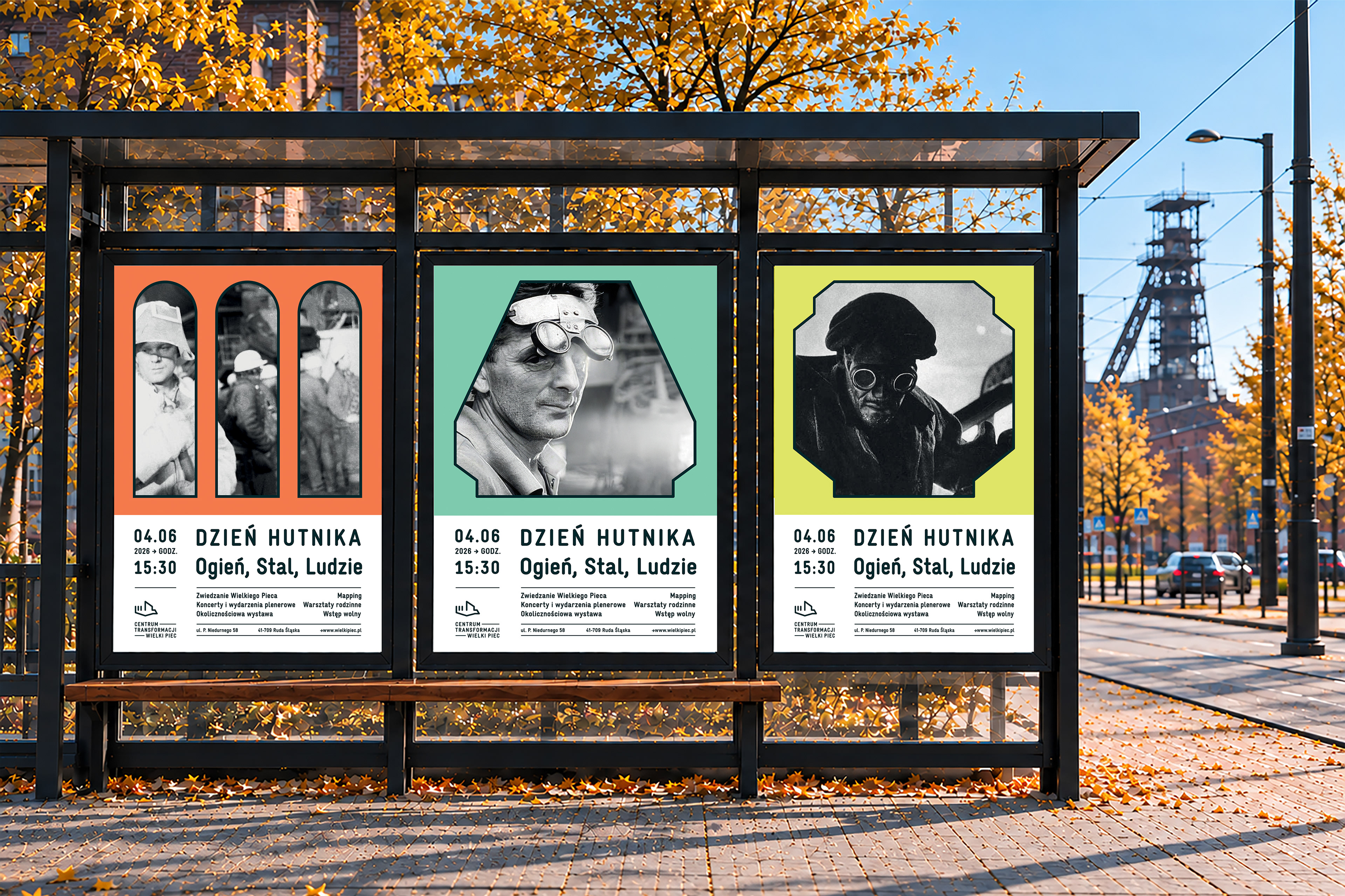
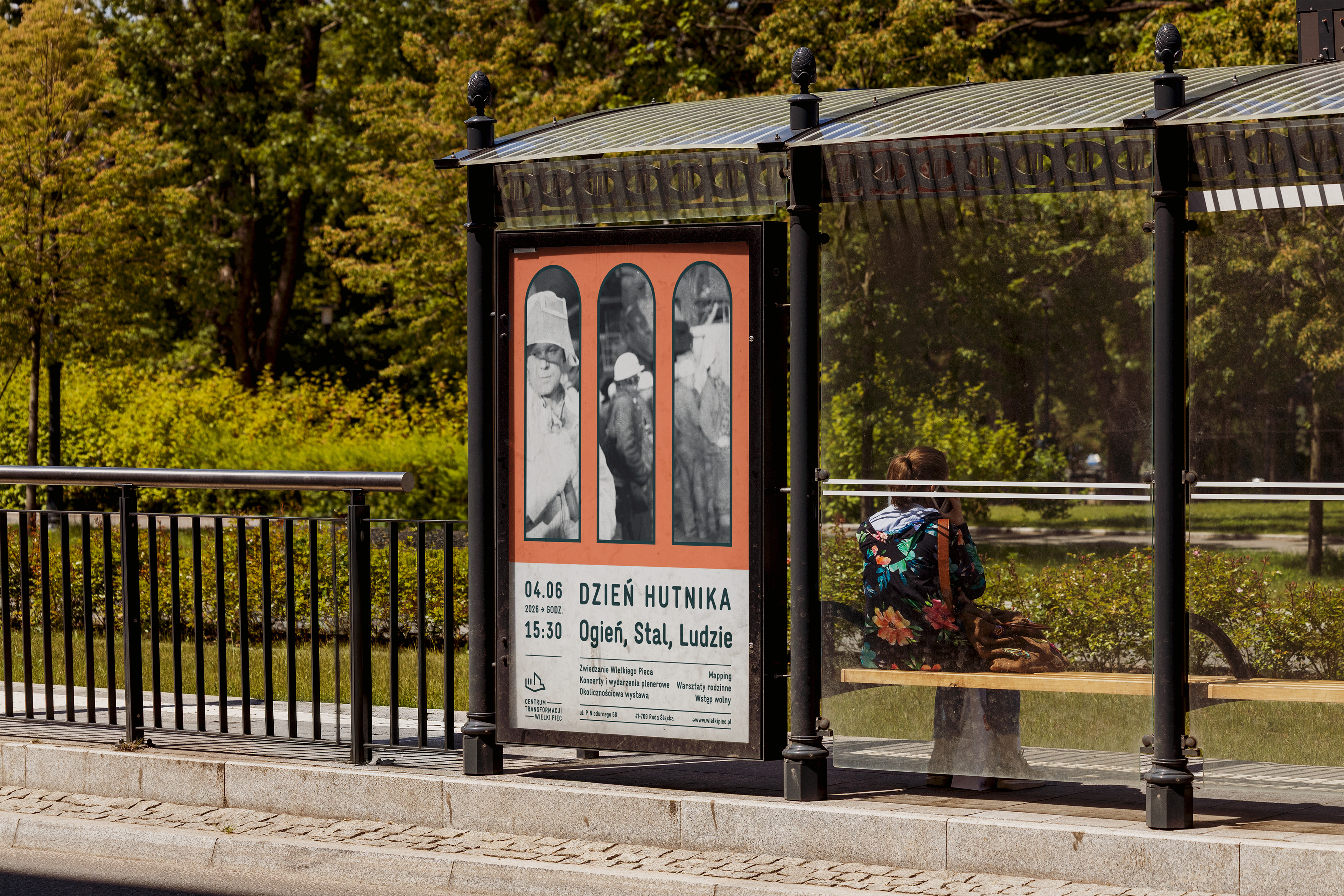
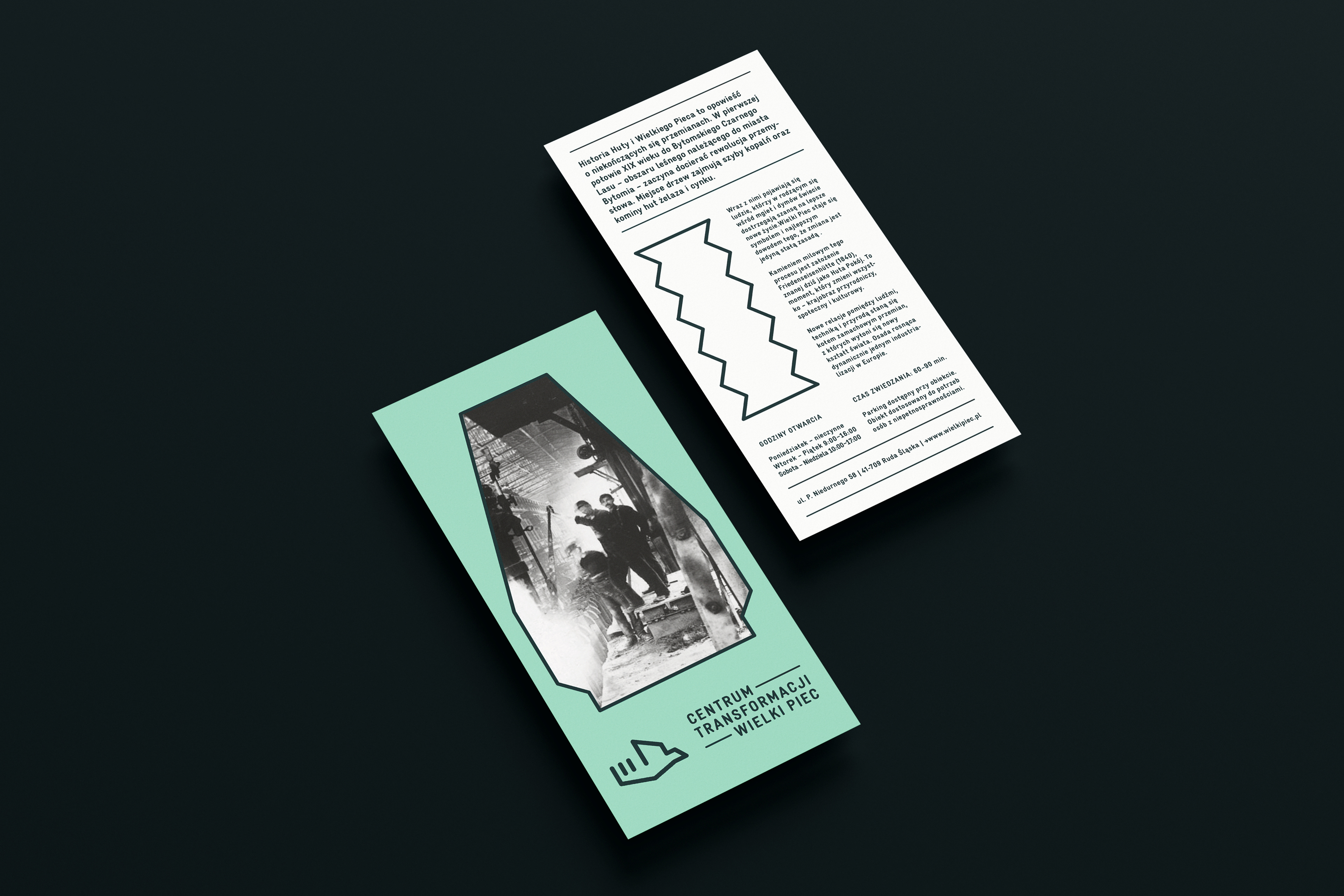
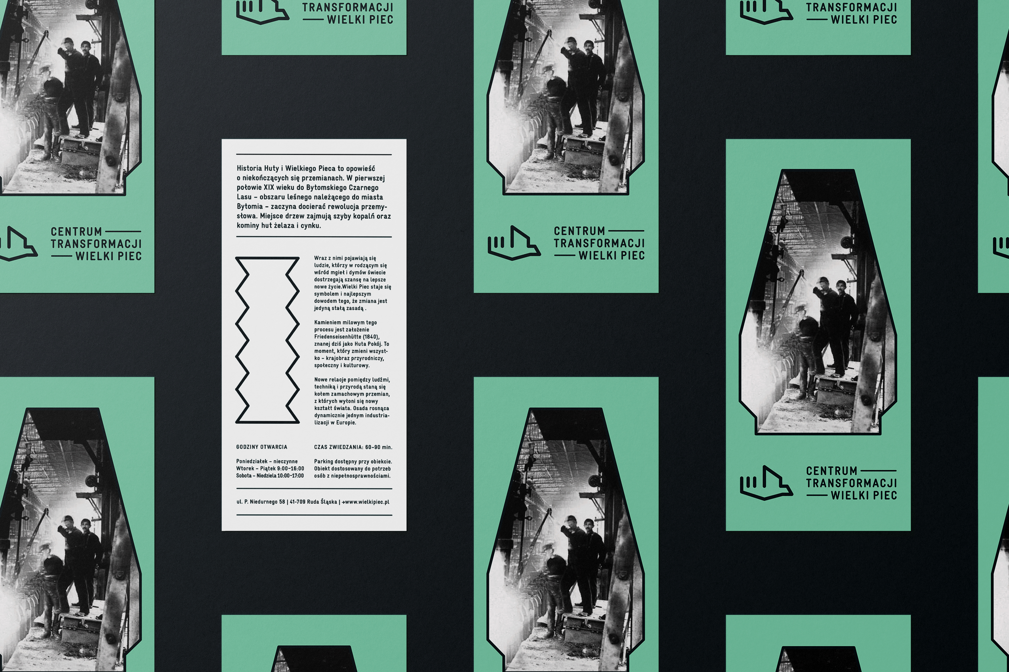
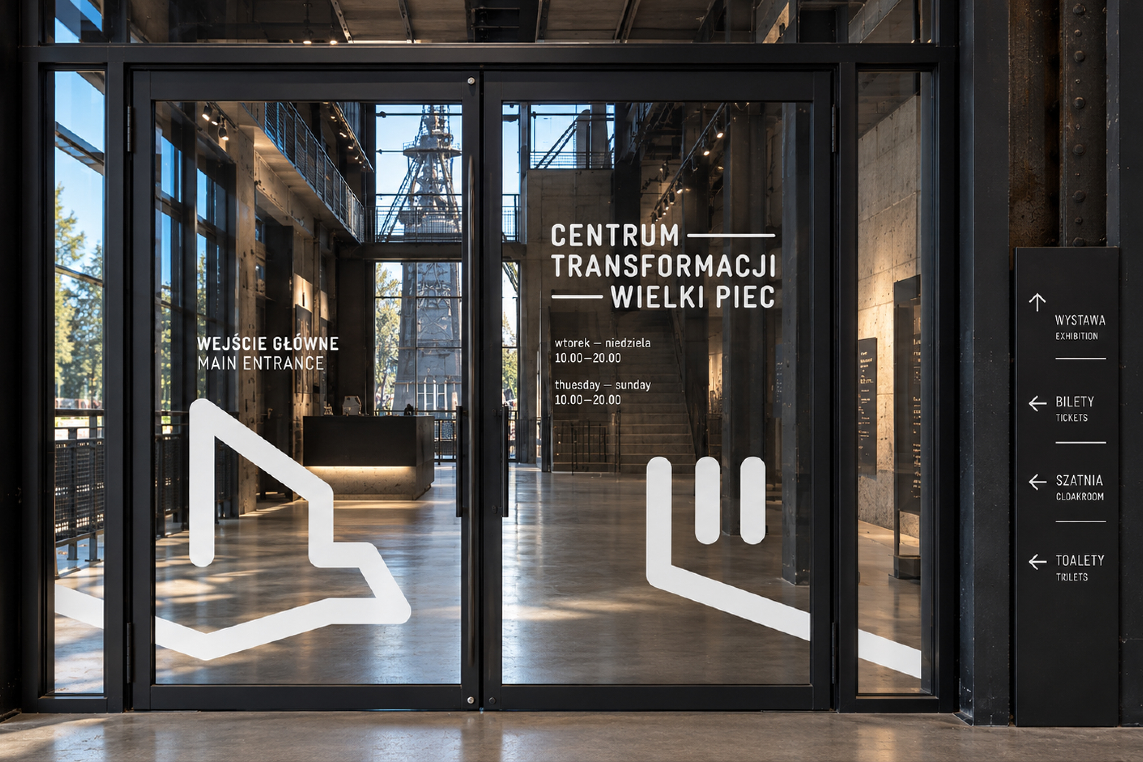
The logo became the foundation for a broader visual system. LL Gravur, inspired by technical lettering and industrial signage, defines the typographic character of the identity. Geometric forms derived from industrial architecture, machinery and tools are used as frames for photography, while a custom system of icons and pictograms follows the same grid, proportions and line weight as the symbol. Together, these elements create a consistent visual language for both communication and wayfinding.
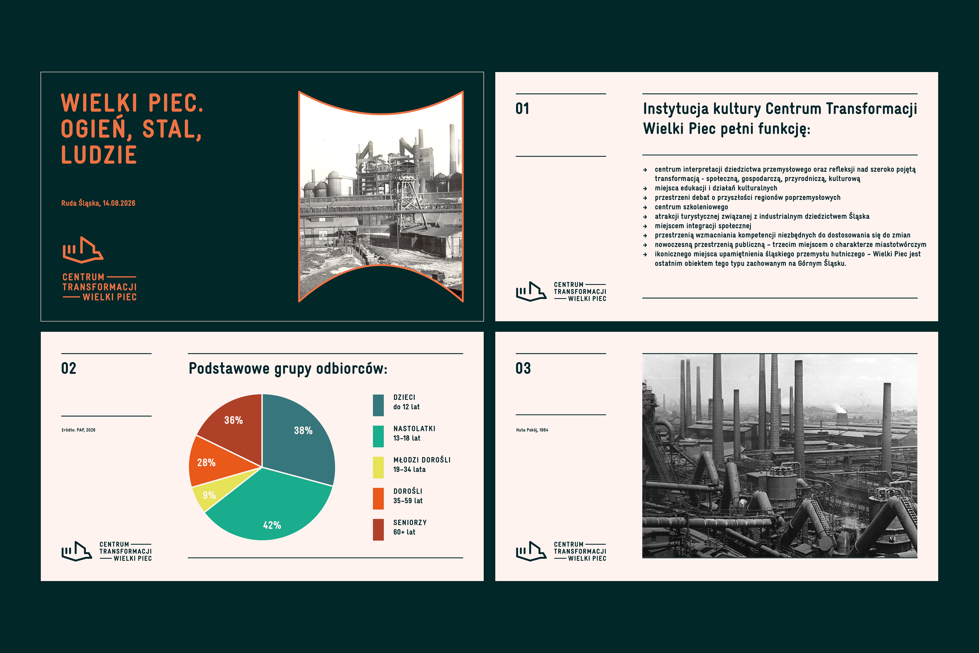
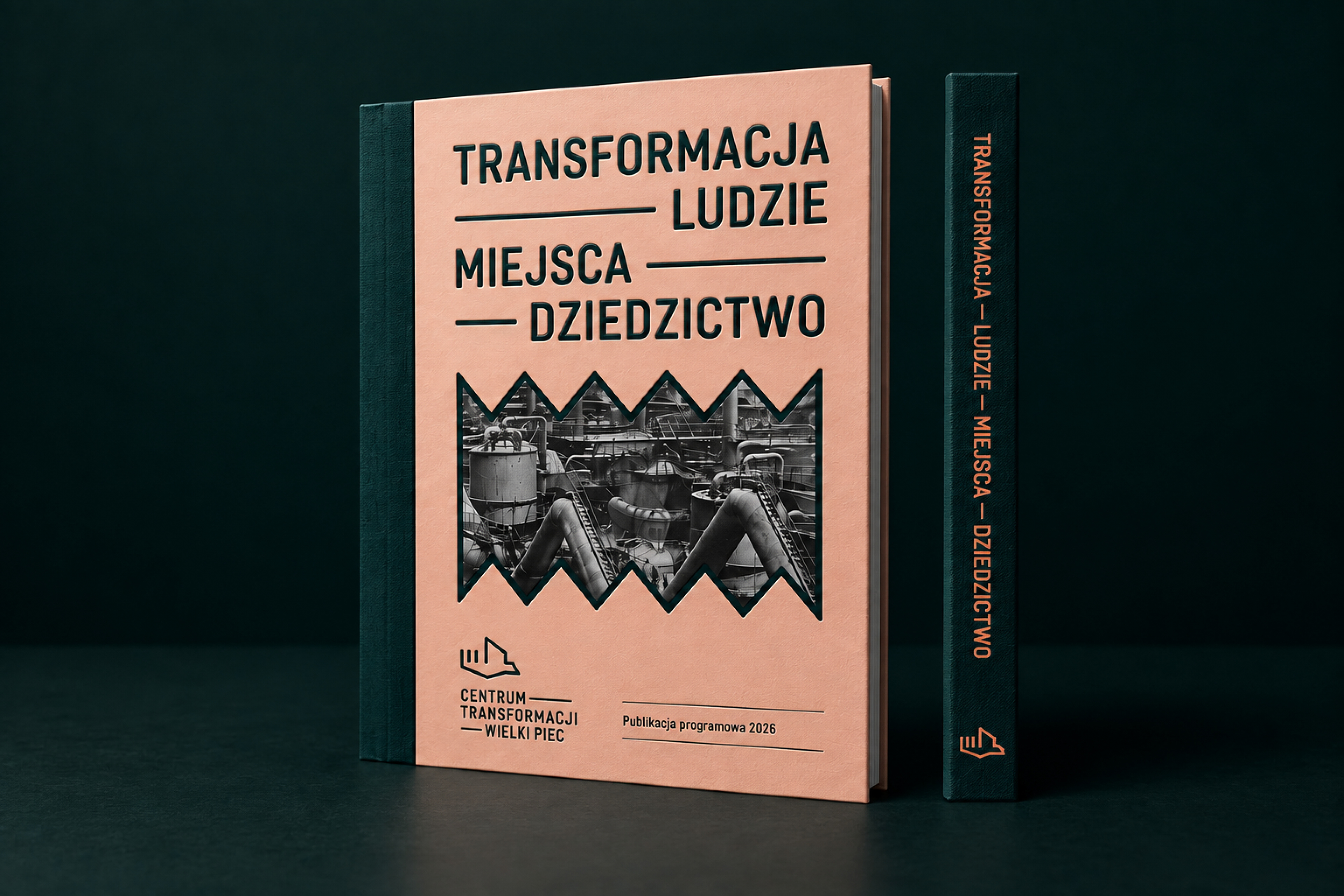
Black-and-white photography is paired with deep and patinated greens, complemented by orange, clay, light beige and lime. The palette reflects the industrial character of the site while referencing the natural regeneration of post-industrial spaces. The identity was developed across posters, publications, digital communication, social media, maps and spatial signage.