Dynamics, diversity, uniqueness, manifesto – these are the key words used to define Street Art by the organizers of the festival in Katowice. The visual identity of this event symbolized the collision of often juxtaposed energies stemming from the art of the street and liberated for the duration of the festival.
—
Events taking place during the festival make the city come alive, burst with colour, undergo a visual transformation. Filling public space with posters announcing the festival was an integral part of these events. Solvent-based screen printing paints in six different neon colours were used in the production of these posters. These paints have a very high intensity, so the posters were very expressive, they stood out from the background, it was hard not to notice them – they were screaming!
—
When designing the festival identification system it was crucial for that process to closely resemble that of the street artist. The unique disposability of the work was important, randomness, spontaneity. To get this effect the posters were screen printed. A special printing system was developed to allow for a large number of composition variations.
When designing the festival identification system it was crucial for that process to closely resemble that of the street artist. The unique disposability of the work was important, randomness, spontaneity. To get this effect the posters were screen printed. A special printing system was developed to allow for a large number of composition variations.
—
The basis for the identification was a theme lifted from the festival logo, which resembles a drawing of the city. On the basis of the logo six geometric figures were generated, each assigned with one fluorescent color. Six screens with geometric figures and a screen with the typographic layer were prepared. Each poster consisted of two superimposed figures and text information. Because the screen with the figures was able to rotate by 90 degrees, 62 different versions of the poster were obtained. A total of 310 posters were printed.
The basis for the identification was a theme lifted from the festival logo, which resembles a drawing of the city. On the basis of the logo six geometric figures were generated, each assigned with one fluorescent color. Six screens with geometric figures and a screen with the typographic layer were prepared. Each poster consisted of two superimposed figures and text information. Because the screen with the figures was able to rotate by 90 degrees, 62 different versions of the poster were obtained. A total of 310 posters were printed.
—
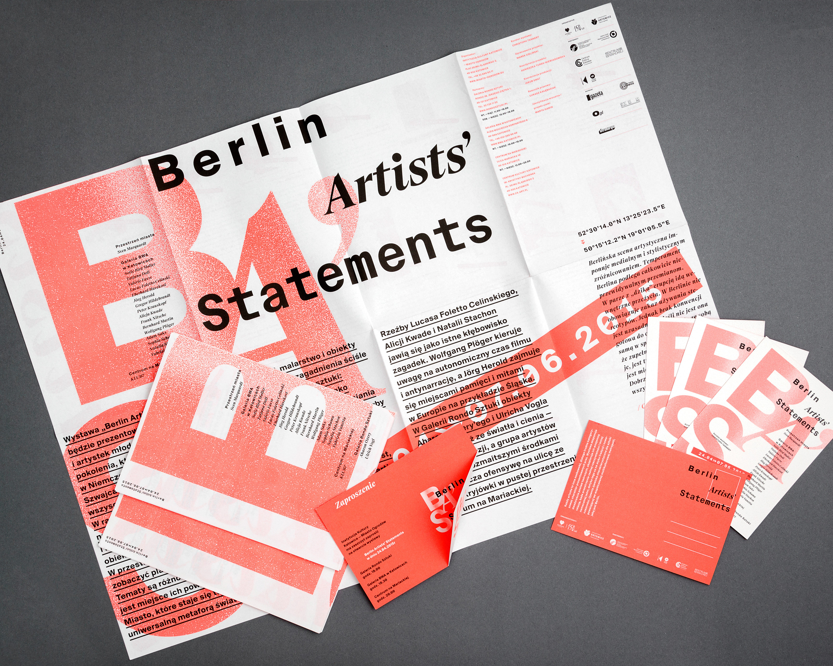
The screens with geometrical figures used to print posters were re-used to print the festival brochures. After printing the information layer, every format then produced five brochures. Thus a certain randomness was achieved, which allowed for every leaflet to be unique, and the final effect to be unpredictable.
The screens with geometrical figures used to print posters were re-used to print the festival brochures. After printing the information layer, every format then produced five brochures. Thus a certain randomness was achieved, which allowed for every leaflet to be unique, and the final effect to be unpredictable.
—
The festival visual identification was completed with a series of gadgets – bags, stickers and buttons – created on the same principle as the posters. A video trailer of the festival was the final element.
The festival visual identification was completed with a series of gadgets – bags, stickers and buttons – created on the same principle as the posters. A video trailer of the festival was the final element.
Printing Scheme:
6 figures that can be rotated 90 degrees + 6 fluo colors
